

Louise Fili has an almost romantic style to her work. There is script text, and swirls and an old-world feel and elegance to what she designs. While her work is not necessarily simplistic, it is not overdone and crowded.
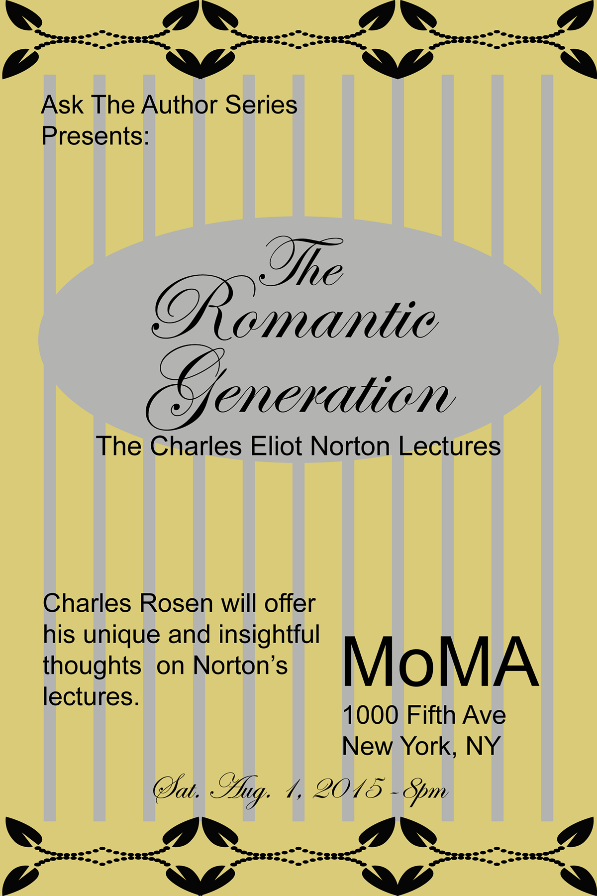
The yellow image has flourishes at the top and bottom as well as the light gray stripes that give the poster the look of Louise Fili. The gray oval draws your eye into the piece to highlight the main title of the image. The script font also has the quality to remind you of Louise Fili. I kept the majority of the text in a much simpler font, Arial, so that it did not become difficult to read. There is a nice contrast between the light yellow and gray in the background and the dark black text. It is easy to read.
The pink poster started out with a simple flower that I made in Illustrator. I made it into a pattern and filled the background with it. It reminds me of old 1940’s wallpaper. Because the background is so busy, I kept the rest of the poster to a minimum. With only a simple box in the same color as the flower to break up the pattern and make the text easy to read. Again, I used a decorative font for only a select bit of the image to give the illusion of elegance, and kept the rest in a simple easy to read font.
I think both posters are successful in that they are not too busy as to be unreadable, but they capture the style and elegance of Louise Fili’s work. The colors to me are what give it that old world charm that she designs have, and they both get across the point of the posters.

